[10] Playtester feedback - March 2019 Edition!
Operation Kanshi » Devlog

Some thoughts: It took longer than I expected to get the game into the new format (changing to the switchboard & three “days” / “cycles” idea). We’ve had a lot of playtesters and some great feedback lately. There is a lot to address. And there are a lot of embarrassing bugs, but we are moving forward and trying to rework some of the design and mechanics still.
Feedback / notes got from faculty & advisors on the latest build (March 2019):
- Playtester A:
- "Seems like it's coming along great. Has a few usability / understanding problems: the audio is hard to make out at times, even with headphones, particularly in the phone-tapping parts. It's not clear what you're supposed to be doing after the phone taps -- pick the right choice? This was unclear and I kept getting red ‘Xs’ which I assume meant that I failed, but I wasn't sure why. The decoding part could stand to get more complex or time-consuming after the beginning where you learn what to do; it's not particularly challenging, which has the downside of making it feel a bit like a chore.”
- Playtester B:
- "Very solid, but seems to be aiming for an audience that might need a more explicit tutorial or UX prompts -- considering I've played Papers, Please and I still missed some basic stuff, it's hard to straddle this line between subtlety / obscurity, and I respect their desire to balance it… but I think they have good methodology and workflow, will definitely get there in the end"
- Playtester C:
- Looking for a way to know decoding successfully is important / key to progress
- Typos can prevent someone from progressing
- You don’t know if you succeeded because of delay
- Playtester D:
- Testing players on how well they are listening is working well–leverage it more, but the testing interface is odd.
- Why is this a switchboard? It can offer more affordances. Is this a better game if I use it? Play with the interface & make it matter.
- Using voice over is a production issue.
- When you turn on the radio, there should be static immediately.
- A “wrong” station should be clear to a player (i.e. an extreme example: animal sounds)
- Needs more effective transition to communicate passage of time
- Make the scenes more unified (like how the radio & typing scene is the absolute minimum but the scale changes)
- Bring intractables to the forefront, declutter. The rest can be faded or grey. Make it look good within constraints.
- Re: players trying to pull / drag the cord: draw it like it doesn’t look like it needs to be pulled.
- Use more effects to cover up sound quality. Use more ambient sounds.
- Major design issue: players are collecting info, but they don’t know what for.
- Gloss over realism / historical accuracy if it is getting in the way right now
- Narrative scope is okay, focus on game design / mechanics now.
Next steps:
- Simplify the wiretap scene and make it cohesive with the size of the radio / typing scene. (See Amanda’s sketch.)
- Can we get the camera to pan right and stay within the same scene / space?
- Cursor changes on hover.
(An example from Vignettes)
- Add a “send” button of some kind.
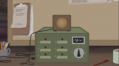
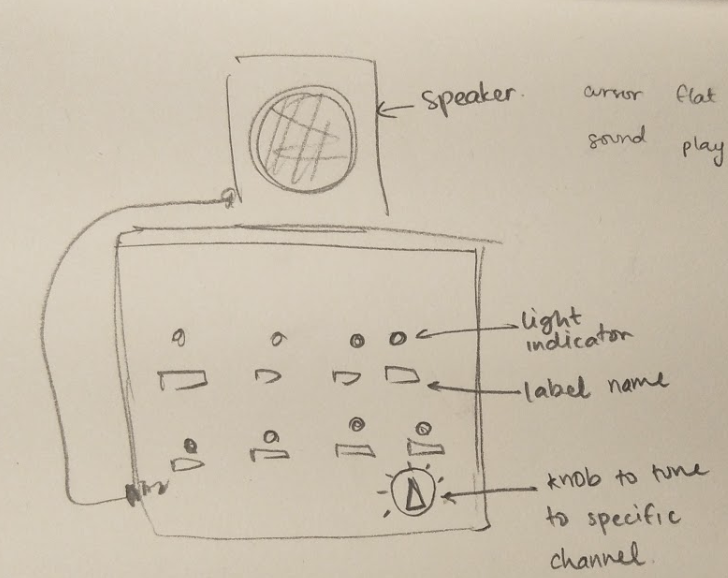
- Essentially rework the switchboard so players are going between different phone lines / conversations, like when they were tuning the radio. This requires sound design that is 1) within the world setting and 2) clearly signals to the player they have the correct or wrong station.
- Re: players are collecting information, but they don’t know what for. Frame the narrative as a “case” of the sisters. Player has just finished a different “case” at the start of the game, so they now know how their intel affects others.
- “Thank you for your intel. The intel you provided led to Person A’s arrest. Person B is in custody.”
- Update intro: “New case: We suspect the Song sisters are trying to flee Mihong. Help us lead to their arrest.”
- Place the explicit instructions across the bottom of the screen during the different scenes as the player needs to do the actions.
- Add feedback to radio transmission when the player gets the correct message!
- Should this be an audio or visual cue? Or both?
- Static for radio when it turns on immediately.
- Newspaper feedback in transition - both the headlines & audio.
- Using a knob to listen in on conversations instead of plugging in. No cables at all, not even plugged in cables. See pictures below.


Get Operation Kanshi
Operation Kanshi
Effective 1NOV49 you are assigned to OPKAN 49.
| Status | In development |
| Authors | Emperatriz Ung, Amanda E. Siswojo |
| Tags | 2D, asian-diaspora, civil-war, espionage, Narrative, nyu-game-center, radio, story-driven |
| Languages | English |
More posts
- [13] A couple bug fixes, music, & pause menuMay 22, 2019
- [12] Operation Kanshi - Trailer & Upcoming Showcase!May 17, 2019
- [11] May 2019 Prototype available! + UpdatesMay 10, 2019
- [09] References / InspirationMar 15, 2019
- [08] March 2019 PrototypeMar 14, 2019
- [07] December 2018 PrototypeJan 03, 2019
- [06] Playtester feedback from December 2018Jan 03, 2019
- [05] On voice oversDec 30, 2018

Leave a comment
Log in with itch.io to leave a comment.